FeatureCard
A feature with media, a heading, and a short description.

Room to explore
Give each direction the space it needs to grow.
More examples
Three features in a grid

Start with a spark
Collect the little ideas worth returning to.
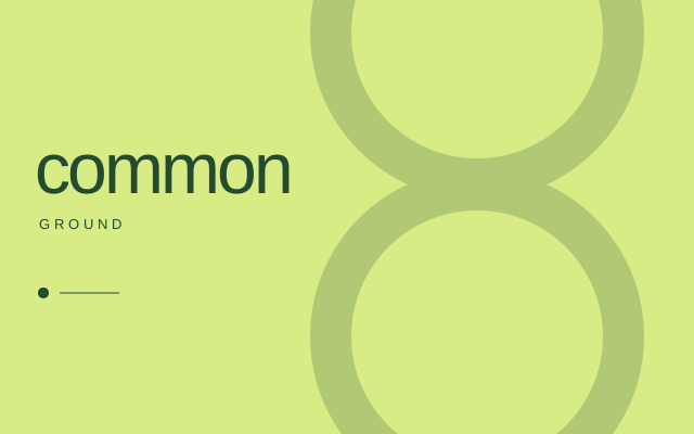
Room to explore
Give each direction the space it needs to grow.

Bring it together
Turn a few good pieces into something you can share.
Source
<script lang="ts">
  import 'portal-bits/styles.css';
  import 'portal-bits/tokens.css';
  import type { Snippet } from 'svelte';

  let { children }: { children: Snippet } = $props();
</script>

{@render children()}
<script lang="ts">
  import FeatureCardExample from './FeatureCardExample.svelte';
</script>

<FeatureCardExample media={"image"} />
<script lang="ts">
  import { FeatureCard } from 'portal-bits';
  let { media = 'image' }: { media?: 'image' | 'fallback' } = $props();

  // A synthetic poster as inline SVG data. Pass your own image URL as `image` instead.
  const poster = `data:image/svg+xml,${encodeURIComponent(
    '<svg xmlns="http://www.w3.org/2000/svg" width="640" height="400" viewBox="0 0 640 400"><rect width="640" height="400" fill="#d8ec86"/><circle cx="440" cy="30" r="135" fill="none" stroke="#244a31" stroke-width="38" opacity=".22"/><circle cx="440" cy="310" r="135" fill="none" stroke="#244a31" stroke-width="38" opacity=".22"/><text x="32" y="178" fill="#244a31" font-family="Arial,sans-serif" font-size="66" font-weight="500">common</text></svg>',
  )}`;
</script>

<div class="narrow">
  <FeatureCard
    title="Room to explore"
    description="Give each direction the space it needs to grow."
    image={media === 'image' ? poster : undefined}
    imageAlt={media === 'image' ? 'Colorful geometric illustration' : ''}
  />
</div>

<style>
  .narrow {
    max-width: 360px;
  }
</style>
API reference
These tables list the props and snippets that FeatureCard declares. Attributes passed through to an element or primitive are listed under Forwarded attributes, not here.
Props
| Name | Type | Default | Required | Binding | Description |
|---|---|---|---|---|---|
title | string | None | Yes | One-way | The heading. |
description | string | None | Yes | One-way | The supporting text. |
image | string | None | No | One-way | The media URL. A failed load keeps the media region with a placeholder. |
imageAlt | string | "" | No | One-way | Alt text for the media. Empty marks it decorative. |
headingLevel | 2 | 3 | 4 | 3 | No | One-way | The heading level of the title. |
Forwarded attributes
None. FeatureCard forwards no attributes.
No data attributes are documented as stable.
Limits
- Not a control. It has no link, button, or selection state.
- The 4:3 media ratio, the inner radius, and the placeholder art are adaptations.